
by Sara Hurley, Director of the Office of E-Learning
Services at the School of Public Health.
I taught composition in a “computer-based classroom” in the early 2000s. Here is how it was set up: the tables were set up into a U shape that seated the 30 students in the class and directly behind the students were computers. There weren’t enough computers for all of the students and they would all be facing away from each other if we used them.
Someone had the best of intentions, clearly wanting to put technology into the classroom to enhance the student experience. However, I suspect that the design of the classroom was about convenience – proximity to power outlets against the walls and space for those large CRT monitors and desktop machines – instead of design that would support instructors or students using the computers as part of learning during a class session.
Design matters. It matters in person because it will affect how we as teachers engage with students and how they engage with each other. The same is true online. In fact, design matters even more online because as teachers we cannot read the room just by looking at it. Ann Fandrey (CLA instructional designer) recently addressed online design in blogging about usability in Moodle, making specific recommendations. For this post, I want to step back and look at what kinds of information we – as instructors or instructional designers – need to gather to make iterative changes that improve courses and the student experience over time. I will draw on lessons learned in working with online courses at the School of Public Health where the Office of E-Learning Services supports SPH online programs and faculty for the courses in these programs. This post focuses on information that individual faculty can put to good use.
Going Big: Usability Study
To start the re-design process, we booked part of a week with Usability Services (and you can too) to test two sample Moodle courses we designed to see how students would interact with a course site. We made very simple assignments that could be completed in a few minutes so that we could test the layout, our instructions, the quiz tool, forums, and the assignment tool. Watching students use the sites was gratifying, revelatory, and confusing at different times during the study.
Gratifying: Assignment instructions.
We tested two versions of quiz and assignment instructions. One was very detailed and spelled out what students could and could not use, as well as detailed information about how to complete the assignment or quiz. The other was a block of text telling students a fairly minimal amount of information. The detailed information, set out in the example below, was the preferred style.
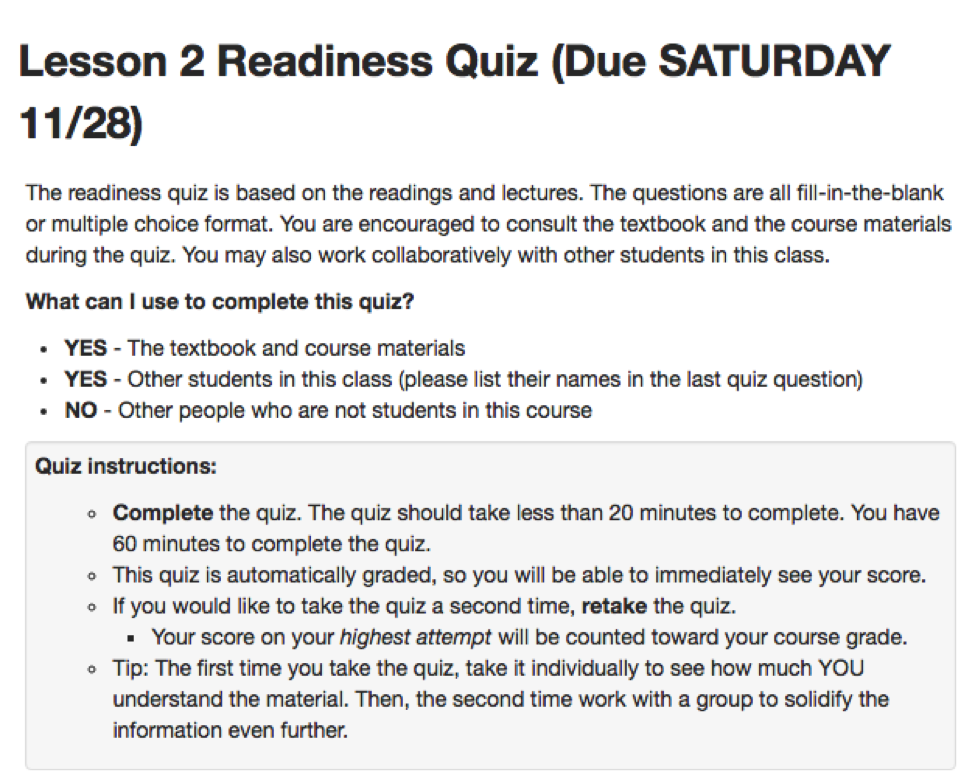
The students appreciated detailed instructions and felt confident that they could complete the work assigned to them and not miss anything. Students would typically skip over information that seemed boilerplate, but anything that involved an assignment was read thoroughly — including complex rubrics.
Revelatory: Lead with assignments.
Why are our students in our courses? They are putting together a series of required and elective courses in order to obtain a degree or credential of some sort. It should be obvious, then, that the primary objective they have when approaching an online course is to identify what they need to do in order to get the grade they want.
We start with learning objectives, because we want to design courses that help students achieve certain outcomes in terms of their knowledge or skill base. And so we often center learning objectives because this is the important stuff! It’s important to students as well, but from week to week what is most important is how they accomplish parts of the course that they are graded on. While the design of a course – aims, assessments, activities, and selection of course materials – is necessarily build on development of course learning objectives, this feedback from students is a call to consider whether the design of the corresponding Moodle site may need to be “flipped.” That is, design may need to be guided by the sequencing and structure of course activities and assessments (eg, papers/projects and exams/quizzes). We need to flip the user experience so that it isn’t just a mirror of how we build a course. This isn’t a trivial for learners or teachers: we have begun to analyze our template, will test these findings in a couple of courses, and refine the construction from there.
Confusing: Who knew anyone used the left navigation?
One of the challenges of being a “super user” of a web interface is that you do not use that interface in the same way as our users do. No one in our office uses the left navigation. Most students who participated in usability testing did. This meant that once students moved into a course week on Moodle they were clicking through what was on display in the left navigation, and were missing labels and other contextualizing information they would have seen on the Moodle course site home page. In the example below, for instance, students would see via the navigation bar a list of activities to access and/or complete:

And these same students, using this mode of navigation, would miss the Labels used in the main course site, placed at the center of the browser screen, that teachers included to provide helpful organization cues and contextual information. Now that we know that students may opt for navigation tools rather than opt to look at the main page once they click the overview, we know that we have to make sure all important information is available on those individual pages or activities for a given week.
We learned a great deal from our usability study, and are chipping away at improvements to our templates and practices. We also launched a student advisory board for e-learning so students can have a voice and make an impact on their courses. (Shameless plug: if you want to learn more about our usability testing and what came of it, come to our E-Learning Summit session, led by Ellyn Buchanan: “They Aren’t Wrong, We Are: Designing Online Courses for How Students Actually Use Them.” (For now, the draft program for the E-Learning Summit, on 27-28 July at Minneapolis Community and Technical College, is available for public viewing.)
DIY: Iterative Improvements
Asking questions.
Some of our faculty go beyond what our office does at a more global level and build feedback into their courses to provide them with information that plays a role in making changes in the course from semester to semester. Midterm feedback (or even more frequent feedback) can help teachers see if things are going the way you want them to and allow you a chance to get the course into shape if it isn’t as well as it should.
If you use the feedback tool in Moodle, you can allow your students to take a survey anonymously. Here are some questions you might want answered:
- Do students understand what is expected of them in each lesson?
- Do students think they are learning (via the learning objectives) what you have said they will?
- Do students feel confident in their ability to study for your course?
- How much are they working each week?
- How is the pace of the course?
- Do the students feel that you and/or the TA are accessible when they need you?
- How is group work going? What can you do to help if not?
- How are the readings going? What has helped them? What have they felt was not used in class?
- Are assignment deadlines causing problems? Especially for working professionals, are there times of week that would be better?
Collaboration: Something in between:
The communities developed within our programs/departments develop important teaching resources. Some of the highest performing SPH faculty we have the pleasure to work with view teaching as a team sport, involving interactions with other faculty, their TAs, the instructional designers, and their students as vital components of success in designing and conducting a course. This allows them to experiment with how they teach and even pilot courses with small groups before it opens up to everyone. They provide feedback to each other and collaborate with anyone willing and able to pitch in.
Unsurprisingly, these collaborations help instructors develop courses that get stellar evaluations.
These workshops can be as formal or informal as you like, but there is huge benefit to getting a group of people together over lunch and pulling a course site up onto a big screen and asking people to have at it, making comments aloud as they look through the site. The group may discover a way of doing something that will incorporate into their own course or Moodle design; and they may also identify confusing parts of the course, or share comments to let you know something didn’t work for them, as well as comments about what they learned from navigating the site.
Design really does matter, and online courses can crack without testing: the design could encourage “cheating” because expectations were never set in the first place, or could be confusing to students unfamiliar with the navigation we design, or could be loosely organized so that students may get lost or feel isolated. Set expectations within Moodle by providing specific context and directions, and students will feel more confident in what they are doing. Design within Moodle to lead them along the path you want them to pursue in preparing for class and completing activities/assignments. Even one of the most fundamental Moodle queries – Tabs versus the full page List of activities for organizing a Moodle site – comes back to design. On this, we learned from students that opening the full list for courses was preferred by students over the tabbed display. The infinite scroll feeling of that listing format can become organized by a design strategy in which instructors make use of Pages to contain the information for the week and only put activities (such as assignments, exams, etc.) on the main page. The students who completed usability testing expressed preference for seeing everything as long as it was organized. They preferred this over Tabs, which can collapse the information for each week onto a single page of its own so that students navigate one Tab for each course week. It all gets back to design. In most courses, infinite scrolling can be avoided with planning for organization.
The great thing about teaching is that we make new discoveries in doing the work and in talking with peers and learners. This is true of online, hybrid, and face-to-face teaching supported by a tool such as Moodle. Talk to your students, collaborate, test things, and adapt over time.


