

Last week’s “Improving Usability of Moodle Course Sites” addressed the first 3 of 6 actions listed below; today’s post offers strategies for an additional 3 actions you can take to ensure usability in your Moodle course websites:
- Identify your users’ main goals
- Unify your messaging
- Minimize interaction costs
- Write for web reading
- Build in accessibility at the content level
- Ensure site vitality
Taken together, the steps can ensure a more consistent and satisfying online experience for students.
4. Write for web reading
It has been well documented that screen reading is different (and more difficult) than reading materials printed on paper. And we cannot use that familiar cut and paste shortcut to transfer representations of printed materials onto a web page and expect that to be screen-readable for students.
Writing for the web is an entirely different thing and, therefore, a vital literacy skill for 21st century instructors.
Format text with headings
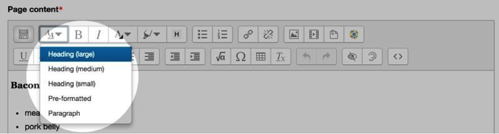
HTML semantic markup, as mentioned in Part 1, is accomplished by means of the text editor in Moodle and is considered best practice. Formatting your online text with the appropriate headers increases scannability (students can quickly scan for the information that meets their goals), and enhances accessibility, especially for students using screen readers and other assistive technologies. (We’ve previously posted about Building Accessible Documents.)
To format text, in short, use HTML markup instead of manually formatting text. The default, plain (non-header) text is called “Paragraph” text in the Moodle text editor:
Use bulleted lists
Bulleted lists increase scannability because they add white space and align the eye at the start of each bullet. Wherever it makes sense for your content to display as a series of bullet points, this will make screen reading easier for students.
Use numerals
Even though it’s contrary to spelling out some numbers as a common editing practice in academic writing, using numerals in on-screen text makes reading easier because it increases scannability. Note how much more quickly you’re able to ascertain the meaning of the second sentence, as compared to the first:
I ate sixteen grapefruits and four toast points for breakfast this morning.
I did 16 sit-ups and sang 4 songs before breakfast this morning.
(One caveat: do write out the number if that number opens a sentence; as in the example of this paragraph, use of a numeral at the start of a series of words might prompt readers to expect a list will follow.)
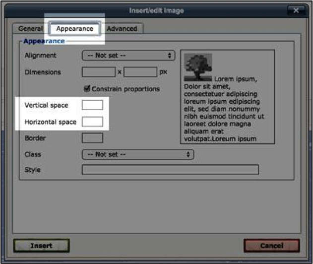
Add relevant images with image padding
Relevant images provide additional means of representing content while also giving the student’s eye a much-deserved break from a text-heavy page. You can add padding (space) to tell the browser to render space around images in the “Insert Image” dialog box shown here:
Underlining = hyperlinks
Underlining is now discouraged anymore as a means to emphasize information because it has become a visual signal for the presence of a hyperlink. If a student clicks on text that is underlined, she will expect it to lead somewhere else, and if it doesn’t, she will assume it’s a broken link.
Similarly, use of italics for providing emphasis is not the best idea either because it’s difficult to read, especially on screen. Bold is the recommended method to provide emphasis.
5. Build in accessibility from the start
Accessibility refers to the ease with which someone with different abilities can use and interact with the course materials on the website. When we’re talking about accessibility we’re talking about not only sensory impairments but also cognitive (e.g., attention deficit), physical (e.g., needs to use a mouse to navigate the site) and situational (e.g., accessing the site from an area of low bandwidth or from a mobile device) issues as well. Universal design, within the scope of this article, may begin with one simple intervention for your site: utilize your college’s course reserves service to create permalinks to the readings in your course. This is accomplished by simply sending a list of citations to your reserves librarian, and they generate the permalinks. Use these permalinks in the content pages of your site. Four great reasons to adopt this practice:
- PDFs are converted images-based to text-based PDFs, making them accessible to screen readers. (Note: not all permalinks lead to PDFs; some links lead to HTML pages or book chapter content.)
- PDFs are reduced to a smaller file size, so downloads require less student bandwidth and less storage space on the student’s mobile or desktop device.
- For items that are not available through the libraries and that you do not feel comfortable claiming fair use on, the librarian will connect you with the Copyright Permissions Center, a service that researches whether any copyright fees are assessed by the publisher. (Note: Fair use claims only apply to materials for which copyright fees are not being paid)
- The librarian will check for permissions and let you know if the publisher requires a fee for use as part of a course. (Note: Instructors still are responsible for claiming educational fair use of the resource).
- You’re helping the libraries track actual use of journal subscriptions, which they can’t track if your students are accessing your own copies of PDFs in your Moodle site.
Accessible formatting extends to the other types of documents included in Moodle sites as well; see the UMinn Accessibility site for information on formatting Word documents, PowerPoint slides, and PDFs. And see your local library resources pages for more information about course reserve processes; for UMinn readers, that information is available at this URL: https://www.lib.umn.edu/services/eres.
6. Ensure site vitality
A course is a living thing. Content strategists go to great lengths in website planning to ensure that all the content that is visible to the user is relevant, workable, and useful – that every piece of information gives the sense of being contemporary, recently touched by a human being.
There is no place more important to ensure vitality than on an online course Moodle site, where students are mediated by distance in their experience of it.
Four quick and simple ways to ensure vitality of your site:
- Deleted unused side blocks (any of these blocks can be re-added later).
- Suppress unused Topics (by default, 16 topics are active, and you can change this in Administration > Settings).
- Check ALL hyperlinks, EVERY time you teach a course.
- Contain announcements to Quickmail or a dedicated Course Announcements folder, rather than placing alerts in the prominent intro section of the Moodle homepage (as announcements appearing in the main body of the course site quickly become outdated and forgotten about, with no indication to the student of the due date).
Ann Fandrey is an instructional designer in College of Liberal Arts at UMinn and lead author on the reMoodle Project; through this service, CLA instructors and teaching assistants are eligible for a complete “reMoodle”, including consultations with the Technology Enhanced Learning (TEL) team in applying web usability principles to existing Moodle sites.
Special thanks to Danika Stegeman and Shane Nackerud for their contributions to this segment.


